Variability, also called dispersion or spread, refers to how much the data values differ from one another. It shows whether the data points are closely clustered around the mean or widely scattered across a range of values.
Measuring variability is important because two datasets can have the same mean but very different spreads. For example, exam scores of two classes might both average 70, but if one class’s scores range from 68 to 72 while the other ranges from 40 to 100, their variability tells very different stories about performance stability.
Variability is commonly measured using:
Variability describes how spread out the data points in a dataset are. It tells us whether the values are tightly grouped around the centre or widely scattered.
Moreover, variability shows how much the data fluctuates from one observation to another.
This concept contrasts with central tendency (mean, median, and mode), which only shows the average or typical value of a dataset. While central tendency gives you a single summary number, variability reveals the degree of difference among the data points.
For example, imagine two small groups of students taking a quiz:
Both groups might have the same average score (mean of 80), but their variability is clearly different. Group A’s scores are consistent and close together, while Group B’s scores are scattered across a much wider range.
When variability is low, the data points are close to each other, suggesting greater consistency and predictability. When variability is high, the data are more spread out, indicating uncertainty or possible outliers.
For instance, a company analysing monthly sales might find two regions with the same average revenue but vastly different spreads. The region with less variability reflects a more stable market, while the one with high variability may face unpredictable factors.
A good understanding of variability, therefore, increases data reliability, generalisation of results, and decision-making accuracy in research and everyday contexts.
| Measure | Definition | Best For | Limitation |
|---|---|---|---|
| Range | Difference between the highest and lowest values | Quick and simple check of the spread | Affected by outliers |
| Interquartile Range (IQR) | Middle 50% of data (Q3 – Q1) | Skewed distributions, resistant to outliers | Ignores extreme values |
| Variance | Average of squared deviations from the mean | Detailed statistical analysis | Measured in squared units, less intuitive |
| Standard Deviation | Square root of variance | Most common for normal distributions | Sensitive to extreme values |
The range is the simplest measure of variability in statistics. It shows how far apart the smallest and largest values in a dataset are. In other words, it tells you the total spread of the data.
Range = Maximum value – Minimum value
This single number provides a quick snapshot of how widely the data points are distributed.
Consider the dataset: 5, 8, 12, 15, 20
Range = 20 − 5 = 15
So, the range of this dataset is 15, meaning the data points are spread across 15 units.
We make sure our interpretations are:

The interquartile range (IQR) is a more refined measure of variability that focuses on the middle 50% of data. It shows the spread of values between the first quartile (Q1) and the third quartile (Q3).
IQR = Q3 − Q1
Here,
Let’s take the dataset: 4, 6, 8, 10, 12, 14, 16, 18, 20
IQR = Q3 − Q1 = 16 − 8 = 8
So, the interquartile range variability is 8, meaning the central half of the data spans 8 units.
The IQR is less affected by extreme values or outliers, making it ideal for skewed distributions or datasets with non-normal patterns. It provides a clear picture of where the bulk of the data lies, ignoring the tails of the distribution.
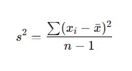
Variance is a key measure of spread that shows how far each data point is from the mean on average. It calculates the average of squared deviations, the differences between each data point and the mean.
Variance plays a vital role in statistical analysis, forming the basis of tests like ANOVA (Analysis of Variance), regression, and other inferential methods. It captures the overall variability and is useful for comparing datasets mathematically.
Where:
Let’s consider the dataset: 5, 7, 8, 10
x = (5 + 7 + 8 + 10) / (4) = 7.5
| Data (x) | Deviation (x – \text{mean}) | Squared Deviation (x – \text{mean})^2) |
|---|---|---|
| 5 | -2.5 | 6.25 |
| 7 | -0.5 | 0.25 |
| 8 | 0.5 | 0.25 |
| 10 | 2.5 | 6.25 |
s^2 = (6.25+0.25+0.25+6.25) / (4−1) = 13 / 3
So, the variance measure of spread for this dataset is 4.33.
Variance represents how much the values differ from the mean on average, but since it squares deviations, the units are squared. For example, if data are measured in centimetres, variance will be in square centimetres (cm²). This makes it less intuitive to interpret directly.
The standard deviation (SD) is one of the most widely used measures of variability. It represents the average deviation from the mean and is simply the square root of variance, bringing the units back to the same scale as the original data.
The standard deviation is most effective for normally distributed data, where values follow a bell-shaped curve.
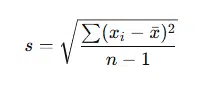
Using the same dataset (5, 7, 8, 10) where variance = 4.33:
s = 4.33 = 2.08
So, the standard deviation variability is 2.08, meaning that on average, each data point lies about 2.08 units away from the mean.
Because standard deviation is expressed in the same units as the data, it’s easier to interpret than variance. A smaller SD indicates that data points are closely clustered around the mean (low variability), while a larger SD means the data are more spread out (high variability).
For example:
Numbers alone can sometimes make it hard to grasp how data are spread out. That’s where visualising variability in data becomes valuable. Graphical representations make patterns, outliers, and spreads easier to see, helping you interpret the data at a glance.
A histogram shows how frequently each value (or range of values) occurs in a dataset. The width of the bars represents the intervals, while the height shows the frequency.
A box plot provides a clear picture of how the data are distributed around the median.
Example
In a box plot of exam scores, a short box and whiskers mean most students scored close to the median, with low variability. A longer box or extended whiskers indicate more spread in scores, indicating high variability.
Error bars are often used in charts (such as bar graphs or scatter plots) to show the variability or uncertainty in data. They can represent measures like the standard deviation, standard error, or confidence intervals.
Measures of variability in statistics describe how spread out or dispersed the values in a dataset are. They help you determine if data points are clustered around the average or widely scattered. Common measures include range, interquartile range (IQR), variance, and standard deviation.
The importance of measures of variability lies in showing the consistency and reliability of your data. While averages reveal central values, variability tells you how stable or unpredictable your data are.
The main types of variability measures are:
To calculate the range, subtract the smallest value from the largest value in the dataset. For example, if your data are 10, 20, 25, and 30, then Range = 30 – 10 = 20. It’s the simplest measure of variability.
Variance measures the average squared deviations from the mean, while standard deviation is the square root of variance. Standard deviation is easier to interpret because it uses the same units as the original data, unlike variance, which uses squared units.
Use the interquartile range when your dataset contains outliers or is skewed. IQR focuses on the middle 50% of values, making it less affected by extreme data points. It’s ideal for summarising data spread in non-normal distributions.
A low standard deviation means the data points are close to the mean (low variability), while a high standard deviation indicates that the data are more spread out (high variability). It’s a key indicator of data consistency.
You can visualise variability in data using histograms, box plots, or error bars. These charts make it easy to see how data are distributed, where outliers occur, and how different datasets compare in terms of spread.
The best measure depends on your data type and distribution:
Central tendency shows the middle or average value of the data, while variability shows how much the data deviates from that centre. Together, they give a complete picture of your dataset’s behaviour and reliability.

All work is written by human writers. 100% AI free, guaranteed.

100% money back guarantee if you find plagiarism in our work.
COMPANY DETAILS