A frequency distribution is a method used to organise and summarise data so that patterns and trends can be easily understood. It shows how often each value or range of values occurs within a dataset.
Basically, frequency distribution helps convert raw data into a clear, structured format that makes interpretation easier for researchers and readers alike.
In academic research, frequency distribution is handy when working with large datasets. It allows scholars to organise, visualise, and analyse data effectively before moving to more advanced statistical tests.
A frequency distribution provides a clear picture of how data values are spread across a dataset. It shows patterns, trends, and data organisation by indicating how frequently each observation occurs.
This helps researchers quickly identify concentrations of data, detect anomalies, and understand the overall shape of the data distribution.
In statistics, frequency distribution acts as a bridge between raw data and meaningful analysis. When data are simply listed, it can be difficult to interpret. When the data is organised into a frequency table, patterns become more visible. This structured representation helps in both descriptive and inferential analysis.
An example of frequency distribution in everyday data could be the number of hours students spend studying each day. If most students study between 2 and 3 hours, that interval will have the highest frequency.
A frequency distribution can take several forms depending on how the data are presented and analysed. The main types include
An ungrouped frequency distribution displays individual data values along with their corresponding frequencies. It is typically used when the dataset is small and values do not need to be combined into ranges or intervals.
Example: If five students score 4, 5, 6, 5, and 7 in a quiz, the ungrouped frequency distribution simply lists each score and how many times it occurs.
Ungrouped distributions are ideal for small or precise datasets where individual data points are meaningful and easy to analyse without grouping.
A grouped frequency distribution is used when dealing with a large dataset. In this method, data are divided into class intervals, ranges of values that summarise multiple observations.
Example: If you have exam scores ranging from 0 to 100, you might create class intervals such as 0-10, 11-20, and so on. Each interval’s frequency shows how many scores fall within that range.
In order to form class intervals:
This approach simplifies analysis and reveals data trends more clearly, especially in large-scale research.
Our writers are ready to deliver multiple custom topic suggestions straight to your email that aligns
with your requirements and preferences:
A cumulative frequency distribution shows the running total of frequencies up to a certain point in the dataset. It helps researchers understand how data accumulate across intervals and is particularly useful for identifying medians, quartiles, and percentiles.
Example: If class intervals represent ages (10-19, 20-29, 30-39), the cumulative frequency of 30-39 includes all individuals aged 10-39.
A cumulative frequency table provides a quick overview of how many observations fall below or within a particular class range, supporting deeper statistical analysis.
A relative frequency distribution expresses each class’s frequency as a proportion or percentage of the total number of observations. It shows how frequently a category occurs relative to the whole dataset, making it valuable for comparative analysis.
Relative Frequency = Class Frequency / Total Frequency
For example, if 10 out of 50 students scored between 70-80, the relative frequency for that class is 10 ÷ 50 = 0.2 (or 20%).
This type of distribution is beneficial in comparing datasets of different sizes and is widely used in data visualisation, probability studies, and business analytics.
A frequency distribution table organises raw data into a structured form. Here are the key components
| Class Intervals | These represent the data ranges or groups into which values are divided. Each interval should be mutually exclusive and collectively exhaustive. |
|---|---|
| Frequency | This shows the number of observations that fall within each class interval. It helps identify the most common data ranges. |
| Cumulative Frequency | This is the running total of frequencies as you move down the table. It is useful for identifying medians and percentiles. |
| Relative and Percentage Frequency | These express frequencies as proportions or percentages of the total number of observations. |
| Tally Marks and Symbols | Tally marks are often used to count occurrences before converting them into numerical frequencies. They serve as a visual aid during manual data collection. |
Here is a step-by-step guide to help you build one manually and in Excel.
Class Width = (Highest Value – Lowest Value) / Number of Classes
Create non-overlapping intervals (e.g., 0-10, 11-20, 21-30). You have to make sure that the intervals cover the full data range.
Count how many data points fall into each class interval, and record the counts in the frequency column.
| Class Interval | Frequency (f) | Cumulative Frequency (CF) | Relative Frequency (RF) |
|---|---|---|---|
| 0-10 | 4 | 4 | 0.20 |
| 11-20 | 6 | 10 | 0.30 |
| 21-30 | 5 | 15 | 0.25 |
| 31-40 | 5 | 20 | 0.25 |
| Total | 20 | – | 1.00 |
In Excel:
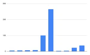
A frequency distribution graph helps illustrate how values are spread across categories or intervals. When visualising frequency distribution, always label axes clearly, use consistent scales, and highlight key patterns or peaks.
Below are the main types:
Modern researchers often rely on statistical software to generate frequency distributions quickly and accurately. Two of the most commonly used tools are Microsoft Excel and SPSS (Statistical Package for the Social Sciences).
Excel offers several built-in features for creating a frequency distribution table efficiently.
=FREQUENCY(data range, bins range)
You can also use Pivot Tables:
Excel’s Insert Chart feature allows you to create histograms, bar charts, or frequency polygons.
SPSS provides a quick, automated way to create frequency tables using the Descriptive Statistics tool.
The output includes both frequency tables and visual charts (such as bar graphs or histograms), allowing for quick interpretation of results. SPSS also provides additional descriptive statistics like mean, median, and mode within the same interface.
If 60% of respondents rate satisfaction as “High” and 10% as “Low,” the frequency distribution indicates that the majority of participants perceive a positive experience.
A frequency distribution is a way of organising data to show how often each value or range of values occurs in a dataset. It helps researchers identify patterns, trends, and variations within data, making analysis easier and more meaningful.
The four main types are ungrouped, grouped, cumulative, and relative frequency distributions. Each type presents data differently depending on the dataset’s size and purpose, from raw counts to cumulative and percentage-based formats.
To create a frequency distribution table, list all data values or class intervals, count how many times each occurs (frequency), and record totals. You can do this manually or use tools like Excel’s FREQUENCY() function or SPSS’s Descriptive Statistics feature for automated tables.
Frequency refers to the number of times a value appears in a dataset, while relative frequency shows that number as a proportion or percentage of the total. Relative frequency helps compare data categories on the same scale.
To calculate cumulative frequency, add each frequency progressively as you move down the list of class intervals. It shows how data accumulate over a range and is useful for finding medians, quartiles, and percentiles.
In Excel, use the FREQUENCY() function or a Pivot Table to count data occurrences across intervals. Then, add columns for cumulative and relative frequencies. You can also create a histogram using the Insert → Chart option for quick visualisation.
In SPSS, go to Analyse → Descriptive Statistics → Frequencies, select your variable, and click OK. SPSS will automatically create a frequency table with counts, percentages, and cumulative percentages, along with optional graphs.
Frequency distribution is crucial because it simplifies large volumes of data, reveals patterns, and supports statistical analysis. It forms the basis for descriptive and inferential statistics.
You May Also Like

All work is written by human writers. 100% AI free, guaranteed.

100% money back guarantee if you find plagiarism in our work.
COMPANY DETAILS