Ever wondered how researchers turn raw numbers into meaningful insights? In research, statistics help make sense of complex data and allow scholars and analysts to summarise, interpret, and draw conclusions from their findings.
Descriptive statistics is a branch of statistics that focuses on organising and summarising data clearly and understandably. Instead of making predictions or inferences, it simply describes what the data shows.
Descriptive statistics are a set of statistical tools used to describe, summarise, and present data in a meaningful way. Rather than drawing conclusions beyond the data itself, they focus on showing what the data reveals about a particular group or situation.
In simple terms, descriptive statistics help transform raw data into clear insights through numbers, tables, and graphs. They
Example Of Descriptive Statistics In Research
Imagine you surveyed 100 students about their study hours per week. Using descriptive statistics, you could calculate the average (mean) number of study hours, find the most common (mode) value, and identify the spread (standard deviation) of the data. This summary gives a clear overview of students’ study habits without making predictions, which is where inferential statistics would come in.
Descriptive statistics are generally divided into four main types:
These measures identify the centre or average point of a dataset. They summarise where most data points cluster. The three main types are:
Mean Example: If students scored 70, 75, and 80, the mean score is (70 + 75 + 80) ÷ 3 = 75.
Median Example: For scores 60, 70, 80, the median is 70.
Mode Example: If scores are 65, 70, 70, 80, the mode is 70.
While central tendency tells us the “middle,” measures of dispersion explain how spread out the data is.
Example: If the highest mark is 90 and the lowest is 60, the range is 30.
These describe how often each value or category appears in a dataset. Researchers use frequency tables, bar charts, histograms, and pie charts to visualise this distribution.
Example: A frequency table showing how many students fall into different grade ranges (A, B, C, D) helps identify performance trends quickly.
These indicate where a particular value lies within a dataset.
Ranks: Assign numerical positions to values, often used in competitive analysis or performance ranking.
Our writers are ready to deliver multiple custom topic suggestions straight to your email that aligns
with your requirements and preferences:
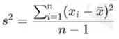
Below are the basic formulas for mean, median, mode, variance, and standard deviation, with simple numeric examples and step-by-step calculations.
Formula (population or sample mean):
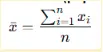
Example dataset: 4, 8, 6, 5, 3
Step-by-step calculation
Result: Mean = 5.2
Procedure: Sort values and pick the middle. If n is even, median = average of the two middle values.
Example A (odd n): 4, 8, 6, 5, 3
Example B (even n): 3, 4, 5, 6
The value(s) that occur most often are called the Mode. A dataset may have one mode, multiple modes, or no mode.
Example: 2, 3, 3, 5, 7 → mode = 3 (appears twice)
Example (no mode): 4, 8, 6, 5, 3 → no value repeats → no mode
There are two common versions:
![]()
Use the population formula when you have the entire population. Use a sample formula when your data is a sample from a larger population.
Example dataset (same as earlier): 4, 8, 6, 5, 3; mean x = 5.2
Results: Population variance = 2.96; Sample variance = 3.70
SD Formulas:
![]()
![]()
Using the variance results above
Interpretation:
Standard deviation gives the average distance of observations from the mean. Smaller values indicate data points are closer to the mean, while larger values indicate they are more spread out.
Quick Reference
Short Worked Example Summary (Dataset: 4, 8, 6, 5, 3)
Here are some of the most widely used descriptive statistics tools that help summarise and interpret data efficiently.
Descriptive statistics in Excel are simple to perform using built-in functions like AVERAGE, MEDIAN, MODE, STDEV, and VAR.
Researchers can also use the “Data Analysis Toolpak” to automatically generate detailed statistical summaries, including mean, standard deviation, and variance.
Excel’s charts and graphs, like bar charts and histograms, make it easy to visualise trends and compare data points.
SPSS is a powerful statistical software widely used in academic and professional research. It allows users to compute descriptive statistics with just a few clicks, generating clear tables for mean, median, mode, and standard deviation.
It is handy for handling large datasets and creating detailed statistical reports that include both descriptive and inferential outputs.
Both R and Python are advanced programming languages popular in data science and academic research.
They allow researchers to automate descriptive statistics, visualise data using packages like ggplot2 (R) or matplotlib (Python), and perform custom analyses.
For example, you can calculate means and standard deviations across thousands of data points in seconds while producing professional-quality visualisations.
For quick analysis, Google Sheets and free online descriptive statistics calculators offer accessible options.
Google Sheets supports basic statistical functions and simple charts, making it ideal for students and small-scale projects.
Online tools like GraphPad, CalculatorSoup, or Social Science Statistics are convenient for quick calculations when software access is limited.
While descriptive statistics summarise existing data, inferential statistics go a step further by drawing conclusions about a larger population based on a sample.
| Comparison Point | Descriptive Statistics | Inferential Statistics |
|---|---|---|
| Purpose | Summarizes and organizes data collected from a sample or population. | Makes predictions or generalizations about a larger population based on a sample. |
| Focus | Describes what is known and visible in the dataset. | Infers what is unknown and extends findings beyond the data collected. |
| Techniques | Mean, median, mode, range, variance, standard deviation. | t-tests, ANOVA, regression, correlation, and $\chi^2$ (Chi-Square) tests. |
| Data Used | The entire dataset or the sample itself. | A sample is used to represent and make conclusions about a larger population. |
| Visuals | Charts, tables, and graphs (histograms, box plots) to display data distribution. | Confidence intervals, p-values, and hypothesis testing results. |
| Example Output | “The average height of 100 students is 170 cm.” | “We are 95% confident the average height of all students is between 168 and 172 cm.” |
When to use descriptive vs inferential statistics?
Descriptive statistics refer to methods used to summarise and describe the main features of a dataset. They include measures like mean, median, mode, range, variance, and standard deviation.
These statistics help researchers understand what the data shows without making predictions or generalisations.
Descriptive statistics summarise and present data, while inferential statistics draw conclusions or make predictions based on that data. For instance, descriptive statistics might tell you the average age in a sample, whereas inferential statistics help determine whether that average represents a larger population.
In Excel, go to the Data tab → click Data Analysis → select Descriptive Statistics → choose your data range → tick “Summary statistics.”
Excel will generate the mean, median, mode, range, variance, standard deviation, and more. This feature helps visualise data quickly through tables and charts.
In SPSS, go to Analyse → Descriptive Statistics → Descriptive (or Frequencies). Select your variables, then choose options like mean, median, or standard deviation. SPSS produces both numerical summaries and visual outputs like histograms or box plots, simplifying interpretation.
Frequencies show how often each value occurs within a dataset and are part of descriptive statistics. Frequency tables and bar charts are common tools to display categorical data summaries.
Percentages express how large one part of your data is relative to the whole, making them a form of descriptive statistics. They are especially useful for presenting survey results or categorical data distributions.
A t-test is an inferential statistical test used to compare means between two groups and determine whether the difference is statistically significant. It goes beyond summarising data to make inferences about populations.
Skewness measures the asymmetry of data distribution:
Enable the Data Analysis ToolPak (if not already active) by going to File → Options → Add-ins → Analysis ToolPak → Go → Check and OK.
Then, select Descriptive Statistics under Data Analysis, input your data range, and tick “Summary statistics.” Excel will automatically generate descriptive measures and charts to help you analyse and interpret your data easily.

All work is written by human writers. 100% AI free, guaranteed.

100% money back guarantee if you find plagiarism in our work.
COMPANY DETAILS